Icon package stylization
-
Hunter23071985
- Posts: 22
- Joined: 2019-01-03T12:48:14-07:00
- Authentication code: 1152
Re: Icon package stylization
Oh my God. Yes, x3a is fine.
But now look at x4.png - instead of changing the hue of the paper, I have colored square behind a paper. )))
But now look at x4.png - instead of changing the hue of the paper, I have colored square behind a paper. )))
-
snibgo
- Posts: 12159
- Joined: 2010-01-23T23:01:33-07:00
- Authentication code: 1151
- Location: England, UK
Re: Icon package stylization
Between x3a and x4, you are flattening the image. Why? Do you want to change just the background paper, or just the foreground dove/horseshoe, or both?
(Sorry, I have to go out. Back in a few hours.)
(Sorry, I have to go out. Back in a few hours.)
snibgo's IM pages: im.snibgo.com
-
Hunter23071985
- Posts: 22
- Joined: 2019-01-03T12:48:14-07:00
- Authentication code: 1152
Re: Icon package stylization
I want to change just the background paper. Without -flatten it does not change, and with -flatten the result you have already seen...
(See you!)
(See you!)
-
snibgo
- Posts: 12159
- Joined: 2010-01-23T23:01:33-07:00
- Authentication code: 1151
- Location: England, UK
Re: Icon package stylization
x3a has composited two images into one. If you want to change the colour of just one of those images, it's easier to do it before you composite them.
"-flatten" will replace fully-transparent pixels (like the top-right of _paper) with the background colour. I don't think you want to do that.
I suggest you first decide what you want to do to the background paper. Experiment with a simple command, for example to make it slightly redder and lighter:
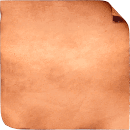
When that does what you want, incorporate the operation in your main command. Put it immediately after reading _paper.png, with the whole thing in parentheses so the operation will only be done on that image.
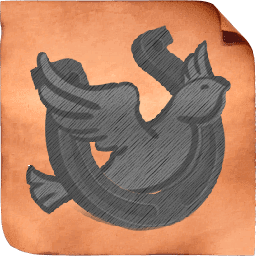
When everything works, you can remove "+write x1.png" etc.
"-flatten" will replace fully-transparent pixels (like the top-right of _paper) with the background colour. I don't think you want to do that.
I suggest you first decide what you want to do to the background paper. Experiment with a simple command, for example to make it slightly redder and lighter:
Code: Select all
magick _paper.png -modulate 120,100,90 paper_mod.png
When that does what you want, incorporate the operation in your main command. Put it immediately after reading _paper.png, with the whole thing in parentheses so the operation will only be done on that image.
Code: Select all
+write x3.png ^
  ( _paper.png -modulate 120,100,90 ^
+write x30.png ^
  ) ^
  -gravity center +swap -compose over -composite ^
+write x3a.png ^
+write x4.png ^
  -colorspace sRGB ^
  "out\%%~nxi"
When everything works, you can remove "+write x1.png" etc.
snibgo's IM pages: im.snibgo.com
-
Hunter23071985
- Posts: 22
- Joined: 2019-01-03T12:48:14-07:00
- Authentication code: 1152
Re: Icon package stylization
Yes, now I understand... And further I think I should choose a less bloody color. 
But it's difficult to do when the paper already has a color.
I don't know Photoshop so well and couldn't create texture of old paper with crumpled and curved edges,
which would be more convenient for repainting through RGBA (without -modulate).
Could you suggest something with imagemagick, please?
But it's difficult to do when the paper already has a color.
I don't know Photoshop so well and couldn't create texture of old paper with crumpled and curved edges,
which would be more convenient for repainting through RGBA (without -modulate).
Could you suggest something with imagemagick, please?
-
snibgo
- Posts: 12159
- Joined: 2010-01-23T23:01:33-07:00
- Authentication code: 1151
- Location: England, UK
Re: Icon package stylization
There are many ways of changing colour. For example, to set a hue (leaving chroma, lightness and alpha unchanged):
The percentage is 0 to 100%, being red, yellow, green, cyan, blue, magenta and back to red.
This sets all pixels to the same hue, green.
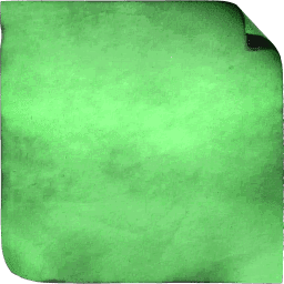
Code: Select all
magick ^
  _paper.png ^
  -colorspace HCL ^
  -channel 0 -evaluate set 33%% ^
  +channel ^
  -colorspace RGB ^
x.pngThis sets all pixels to the same hue, green.

snibgo's IM pages: im.snibgo.com
-
Hunter23071985
- Posts: 22
- Joined: 2019-01-03T12:48:14-07:00
- Authentication code: 1152
Re: Icon package stylization
Yes, thank you, it is very convenient.
And the last thing that worries me is the jagged edges of the dove and horseshoe.
Can this be disguised, for example, with -vignette?
And the last thing that worries me is the jagged edges of the dove and horseshoe.
Can this be disguised, for example, with -vignette?
- fmw42
- Posts: 25562
- Joined: 2007-07-02T17:14:51-07:00
- Authentication code: 1152
- Location: Sunnyvale, California, USA
Re: Icon package stylization
Use some blur on the alpha channel of the overlay image to smooth out the edges.
-
Hunter23071985
- Posts: 22
- Joined: 2019-01-03T12:48:14-07:00
- Authentication code: 1152
Re: Icon package stylization
fmw42, snibgo, added -channel RGBA -blur 0x0.45 and now everything seems fine.
A wonderful program and a wonderful, very warm forum!
Thank you very much for your patience and for your time!
A wonderful program and a wonderful, very warm forum!
Thank you very much for your patience and for your time!
-
Hunter23071985
- Posts: 22
- Joined: 2019-01-03T12:48:14-07:00
- Authentication code: 1152
Re: Icon package stylization
Guys, sorry, it's me again. In the end, I decided to make everything in light shades.
What you can advise to:
1) Emphasize the texture of the icons.
I combined a lot of tools (modulate, level-colors, polynomial, evaluate) to convert white&black to gray and average all other colors.
As a result change something in this construction became a real problem!
I don't quite understand how it works, what's mean plus/minus and how it summarize. Maybe there is another way?
2) Assign RGB-color to the contour of new "_paper.png" without losing transparency.
I usually work with RGB in all editors and just can’t find some shades in HCL.
Maybe I need to remake this "_paper.png" somehow?
Please see what you can advice to this kit.
I understand that this is largely a matter of taste, but your opinion is very important for me.
-
snibgo
- Posts: 12159
- Joined: 2010-01-23T23:01:33-07:00
- Authentication code: 1151
- Location: England, UK
Re: Icon package stylization
When an image is grayscale, "-auto-level" will increase the contrast so the images stretches from black to white, without clipping at either black or white. For greater contrast:
1. "-contrast-stretch" is like "-auto-level" but can increase further by clipping some pixels at black or white.
2. "-evaluate pow" can increase the contrast in the shadows, at the expense of decreasing contrast in highlights (or vice versa).
3. "-sigmoidal-contrast" can increase contrast in midtones, at the expense of decreasing contrast in shadows and highlights (or vice versa).
4. The above operate globally, affecting the entire image. Contrast can also be increased locally. "-unsharp" does this.
5. These and other methods can be combined. For example:
I showed how to change just the hue. If you prefer to change all dimensions of the colour (but leave alpha unchanged), using named colours or #RGB numbers, "-colorize" can do that.
1. "-contrast-stretch" is like "-auto-level" but can increase further by clipping some pixels at black or white.
2. "-evaluate pow" can increase the contrast in the shadows, at the expense of decreasing contrast in highlights (or vice versa).
3. "-sigmoidal-contrast" can increase contrast in midtones, at the expense of decreasing contrast in shadows and highlights (or vice versa).
4. The above operate globally, affecting the entire image. Contrast can also be increased locally. "-unsharp" does this.
5. These and other methods can be combined. For example:
Code: Select all
magick "!! ABViewer.png" -modulate 100,0,100 -auto-level -unsharp 0x3 abviewer_shp.png
I showed how to change just the hue. If you prefer to change all dimensions of the colour (but leave alpha unchanged), using named colours or #RGB numbers, "-colorize" can do that.
Code: Select all
magick test\test\_paper.png -fill red -colorize 100 x1.png

magick test\test\_paper.png -fill #123 -colorize 100 x2.png
snibgo's IM pages: im.snibgo.com
-
Hunter23071985
- Posts: 22
- Joined: 2019-01-03T12:48:14-07:00
- Authentication code: 1152
Re: Icon package stylization
OK, _paper.png become red and transparent, I didn’t guess to add -colorize 100. Thank you!
With contrast task is just the opposite. I'll try to explain it with an example "-modulate 100,0,100 -auto-level -unsharp 0x3":
- !! CheckFlash.png, !! XLaunchpad.png become black; !! AdwCleaner.png, !! AIDA64.png become almost black
- !! Foobar2000.png, !! ABViewer.png become gray
- !! Ascgen.png, !! Win 10 Tweaker.png become almost white
Dark/contrast icons are very visible, white/faded are not visible. Often it's hard to find program you want and NOT to see many you don't need.
So I tried to make all evenly gray - it doesn't irritate the eyes, due to the texture and frames creates one style, as if all are drawn by one master.
At the same time there is grouping programs due to the color of the frame, in each group most important programs are at the beginning.
But the gray I turned out very dark - texture and small details on it are lost. How could it be fixed?
- fmw42
- Posts: 25562
- Joined: 2007-07-02T17:14:51-07:00
- Authentication code: 1152
- Location: Sunnyvale, California, USA
Re: Icon package stylization
I think you need to post an input and output example and your code so we can understand the issue.
-
Hunter23071985
- Posts: 22
- Joined: 2019-01-03T12:48:14-07:00
- Authentication code: 1152
Re: Icon package stylization
It seems the problem was solved. The final code for Windows:
The result. THANK YOU!
Code: Select all
cd /d "%~dp0"
for %%i in (in\*.png) do magick.exe "%%~fi" ^
  -channel RGB ^
  -modulate 100,0 ^
  +level-colors rgb(100,100,100),rgb(170,170,170) ^
  -function polynomial 1.100,-0.100 ^
  -evaluate max 5%% -evaluate min 90%% ^
  -fuzz 5%% -trim -thumbnail 256x256 -filter triangle -channel RGBA -blur 0x0.7 ^
  ( +clone -tile _pencil.png -draw "color 0,0 reset" +clone +swap -channel rgb -compose bumpmap -composite ) ^
  -fx "u*.2+v*.8" ^
  ( _paper.png -fill RGB(255,71,1) -colorize 100 ) ^
  -gravity center +swap -compose over -composite ^
  "out\%%~nxi"
pause