Simple Interpolation
Posted: 2018-06-08T03:58:08-07:00
Hi everyone. I have been using IM for about a week now on a project. I am downloading NEXRAD doppler radar files from the weather service, decoding them and saving to .TIF using the decoding tools.
My images are looking great, but I am wanting to "pretty" them up some for viewing. I suppose I am looking to interpolate them, but you would not believe how much of a noob I am when it comes to image processing. So far, I have been unable to use the interpolate command do do anything. I am probably doing it wrong, or if I am doing anything it's hard to tell the difference. Commands work but I just don't know where to start really. I am looking for general advice to get me started. (Edit: I have been using -transparent and -resample with awesome results, so I understand the very basic concepts of IM)
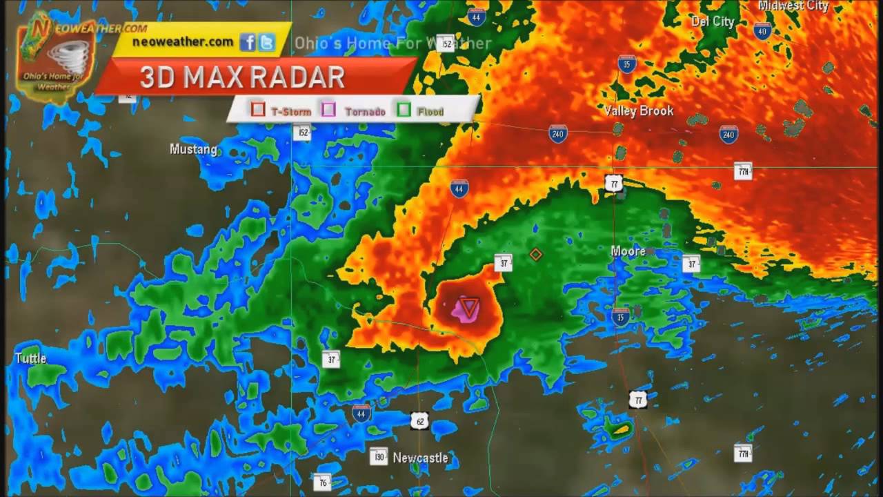
I downloaded a nice storm with a tornado (location in the pink hue area) to test against another image with the same data and time:

This is the storm in the same position and same time, but heavily edited to look pretty : (I used IM to remove the blue pixels from mine, which is why his has blue and mine doesn't. The software that interpolated this image and displayed it was GR2Analyst)

If someone could type out a whole command here to get me on the right track, (a base some some sort I could copy and paste) I would very much appreciate it. I just need to understand how to get started. I am not the best with reading all the complex inputs I see in the interpolation section of the documentation, I seem to get easily confused with it. Again, thank you for any help and I will check back here tomorrow.
My images are looking great, but I am wanting to "pretty" them up some for viewing. I suppose I am looking to interpolate them, but you would not believe how much of a noob I am when it comes to image processing. So far, I have been unable to use the interpolate command do do anything. I am probably doing it wrong, or if I am doing anything it's hard to tell the difference. Commands work but I just don't know where to start really. I am looking for general advice to get me started. (Edit: I have been using -transparent and -resample with awesome results, so I understand the very basic concepts of IM)
I downloaded a nice storm with a tornado (location in the pink hue area) to test against another image with the same data and time:

This is the storm in the same position and same time, but heavily edited to look pretty : (I used IM to remove the blue pixels from mine, which is why his has blue and mine doesn't. The software that interpolated this image and displayed it was GR2Analyst)

If someone could type out a whole command here to get me on the right track, (a base some some sort I could copy and paste) I would very much appreciate it. I just need to understand how to get started. I am not the best with reading all the complex inputs I see in the interpolation section of the documentation, I seem to get easily confused with it. Again, thank you for any help and I will check back here tomorrow.